
Wednesday, October 28, 2009
Thievery Corporation gig poster
There must be an easier way to get the triangles...ah well. I made one green one and copied and moved SO many of them, made the background yellow to form those easily at least. Photographed my friend's sitar who plays with Thievery, attempting to go for a mandala effect as well as the sitar replicated to form an X. The colors are for the reggae influences, the X for their socio-political statements perhaps. Amazing show they put on. Not sure they would like this, I know they are very particular with everything they do. But I like it.


Enter The Haggis

My friend Maddy and I can't clean house without music and, since it was her house we were cleaning, she got to pick the tunes. Usually, I am a country girl but she started to play the weirdest mixture of Celtic, Scottish, Irish, drinking/rock songs and I fell in love with Enter The Haggis (who are really playing at Higher Ground).
In making this poster I redid the shape layers what felt like a million times (really it was only like six times but shape layers are HARD). I learned to utilize the want tool and to FINALLY use the clone tool properly (that's how I made the large Celtic knot). The band is known for it's strange mixture of rock, drinking songs and bagpipes so putting a bagpipe in was a must and after much reforming and distorting I eventually got this Scottish Terrier to play his melodies .
Enjoy,
~AB
Grace Potter and The Nocturnals
 When I decided to do Grace Potter and The Nocturnals as my band, I knew I wanted to play around with the stylus and use her face to create a contour image. Contour drawings have always been interesting to me so I used an image of her playing at a show and traced it with the stylus. I played around with downloading some new "grunge" brushes which was neat and tried downloading some different fonts but found the ones that were already on photoshop worked best.
Monday, October 26, 2009
Gig Poster
 This gig poster was made for a fairly recent band that is from California. They are currently on tour promoting their second album "The Bright Side of Life." This title actually was the focus of my design. When I thought of the bright side of life I immediately thought of sunrises along a body of water. The tree outline was incorporated from the album cover. I learned a lot working on this project. I made my own sun ray pattern and sun. I also started to get the hang of basic shape vectors. I am not a pro at it yet but enjoyed experimenting.


Wednesday, October 21, 2009

When I think of my favorite form of Art I think of Photography. So i decided to remake an Ansel Adams photo for this project I used his photo of A Pine tree on a high peak. Because i Decided to use my own Photos for remakeing the pine It was an almost complete contrast to the sceen of nature in Ansel Adams' photo because my Photos are mostly of rusty old and deteriorating metal.http://graphics8.nytimes.com/images/2005/08/01/arts/adams.184.2.650.jpg link to the Ansel Adams Photo
From the Water into Photoshop


I really enjoy Arno Minkkinen's work, and I thought it would be fun to try and imitate his photo without actually taking a picture of a hand in the water. I first took a picture of a hand holding a pen, then a picture of background trees and that was it. This project was the most challenging mainly because I had misplaced my original and had to start over the day it was due, but I definitely won't forget the techniques I learned creating this.
Monday, October 19, 2009

Art History Project

For this assignment, I decided to remake the piece The Voice of Evil by Georges de Feure. I primarily worked with the pen tool using vector forms. original piece: http://img.photobucket.com/albums/v673/ShiroTsuru/feure1.jpg


Comicbook Girl

I had been browsing Google and found this image that was for sale on a website. I could not find the artist, however, I really enjoyed how bold the lines were, and how much the girls' eyes popped, so I thought it would be an opportune time to try the Tablet and Stylus, to get a hand drawn feel. I also changed the colors to what I found suiting.
Andy Warhol Remakes


These are three remakes that i did of different Andy Warhol projects. First i started off doing two more recognizable Andy pieces, replacing an apple with the banana and beans with Campbell's soup. Then i looked more into some of his other work that wouldn't stick out as much as some of his famous work. I found out that Andy Warhol worked a lot with Polaroids and taking portraits which is something i am very interested in, so i used some of my pictures to create an Andy-esque piece similar to his projects using Polaroids.
Water Lilies

I replicated a Claude Monet water lilies piece. I used images of my own and brushed in the shadows myself. I played around with different filters to give the image a more painted feel but I don't know if I was successful doing this. Overall, I enjoyed this project.
Sunday, October 18, 2009
A Favoraite Photo ReDone
 I decided to recreate Carl Iwasaki's "Teenagers Dating". Since the first time I laid eyes on this picture at a bagel shop in my home town I've been in love with it. I admire the simplicity of a black and white photo and I enjoy trying to figure out how life was in the 60's-- you know; when dishwashers and driers were a miracle to housewives not simply another chore, and when people dressed nicely because it was required (girls hair pinned up and guys keeping their boxers within the confinds of their pants). (see the real image at: http://www.life.com/image/tlp976635 )
This recreation was done with help from my best friend, Keelia, and her boyfriend, Red. It took me all Saturday and Sunday afternoon to get it just right (and even longer to try and figure out how to create the horizontal sidewalk) but I did it!
~ENJOY!
Anna Lambert
Wednesday, October 14, 2009
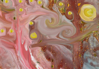
starry windy night
I scanned one of my 4 year old's paintings and started to swirl it around with the smudge tool then changed the hue to make it blue because I wasn't sure how close to the original we had to be after I started. I took a photo of a church and put it on, played with the transforming scale and warp though couldn't figure out how to invert it to be just like the original, then outlined it with the brush so it looked more like a painting. It would have been easier to just draw the church but oh well, practice is good for me. Discovering a bit late how much you can do when you find the different brush styles was fun (suppose just putting paint color instead of scanning a painting for the color would have been faster too but I wouldn't have the little glitter and stars)... by chance I could see two stars, one looking like a reflection in the water so kept them. Layers, many many layer...


Chopping Wood

This is my reproduction of Camille Pissarro's painting "The Woodcutter". I had my brother pose for the original photograph. Then I went in and made it look more like an actual painting. I like that it closely resembles the original painting that it was based on.
Monday, October 12, 2009

 This was my piece that I created to show two worlds merging into one. It was a photograph that I had taken in photography class last year, and I always thought that it looked so sad, so I added the face into the water sho it would seem as though she was looking into her own personal demons. It is very chilling to me.
Rune Olsen is a sculptor from Norway that creates life size animal sculptures out of basic materials. Olsen was the inspiration for my digital project focused on the re-making of a piece of artwork. To see Olsen's piece follow the link: http://www.runeolsen.net/pages.php?content=galleryBig.php&navGallID=14&navGallIDquer=14&imageID=1&view=big&activeType=
Thursday, October 1, 2009


Subscribe to:
Comments (Atom)